Sam’s Club Holiday Campaign
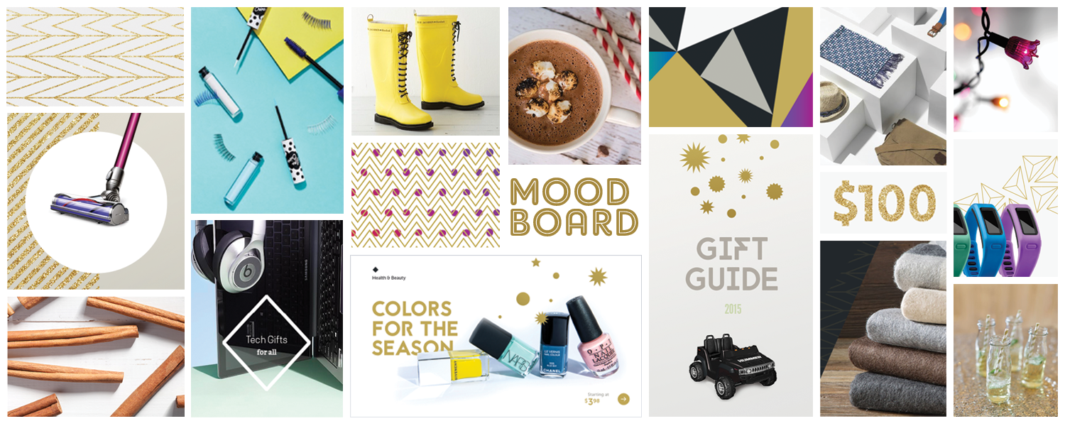
To riff off the new modern look and feel we developed for the Sam's Club brand, we designed a fun, festive holiday campaign for use across multiple events and media. The style leaned heavily into the use of typography, graphic elements, and textures to create interest and movement. In keeping with the new Sam’s Club website, photography was either provided by the manufacturer or stock imagery. The final styles, including colors, were adopted company-wide for all digital, TV and print campaigns—a big win for our Creative team as this was the first time the digital channel any had influence over the in-club creative and marketing.
HOLIDAY CONCEPT
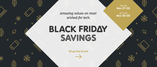
A look that is clean and modern, feels festive, is lively and a true celebration of the season. We created a color palette with monochromatic metallic gradients with hits of bright colors for bursts of happiness and joy throughout. Graphic elements of dots, stars, burts and chevron patterns played up with metallic sparkles and glitter are used as backdrops and set dressings. These graphics are also cleverly used to invoke movement in both the products shown and to take the user through the site. The typography was developed with various bold fonts which were futuristic, but also celebratory in nature. The repetition of right angles and use of the diamond shape in its many iterations is also used to extend and reinforce the Sam’s Club brand in ways that feel new and fresh.
old vs new
HOLIDAY HUB
TREE TRIMMING GUIDE


